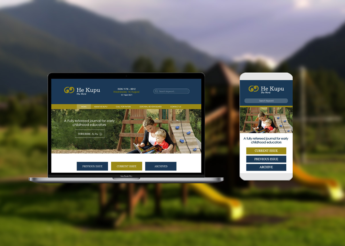
He Kupu is a free online journal published twice a year by New Zealand Tertiary College (NZTC). NZTC aims to develop an inclusive, critical, collaborative and informed community of early childhood professionals – including the research and views of academics, practitioners and students. He Kupu is the perfect vehicle to weave together the different voices of all those working in the sector.
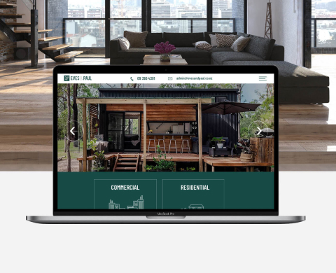
Easily compare and contrast the differences between two images with our interactive Before-and-After Image Slider. Showcase transformations, improvements, and renovations with this customizable widget that is sure to leave a lasting impression on your audience.

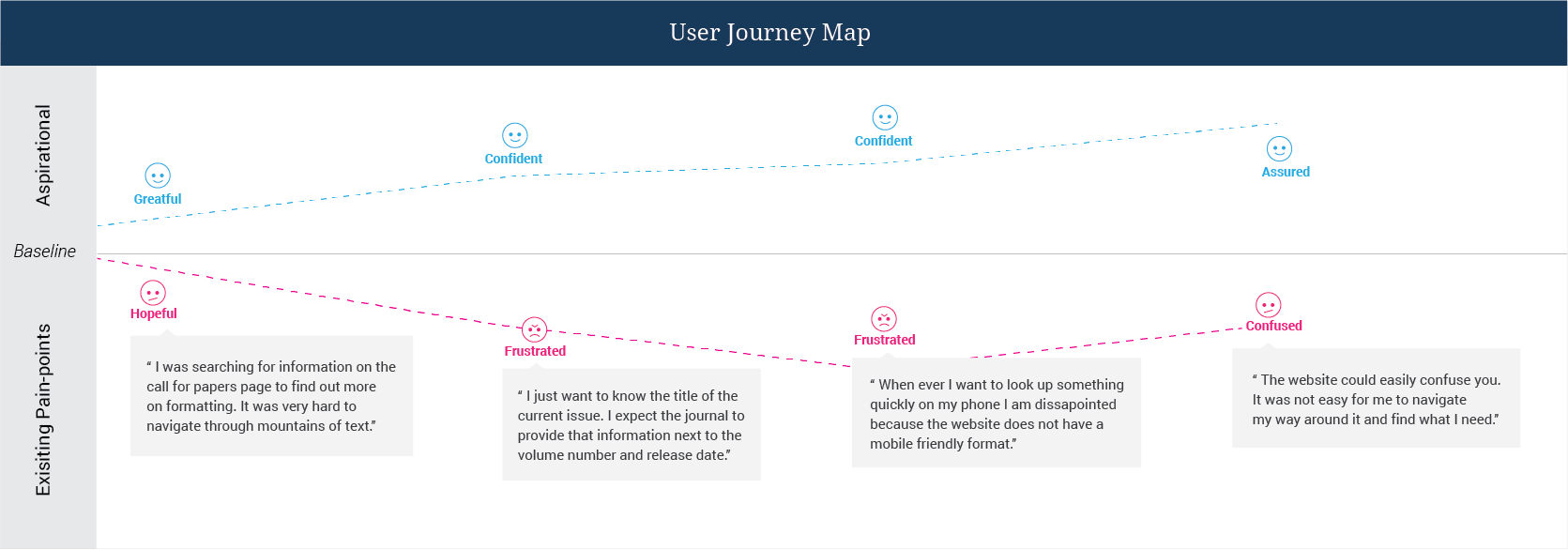
My redesign focused on two primary pain points that disrupted the "Learning Flow" for our professional audience:
To solve these challenges, I applied the following principles:
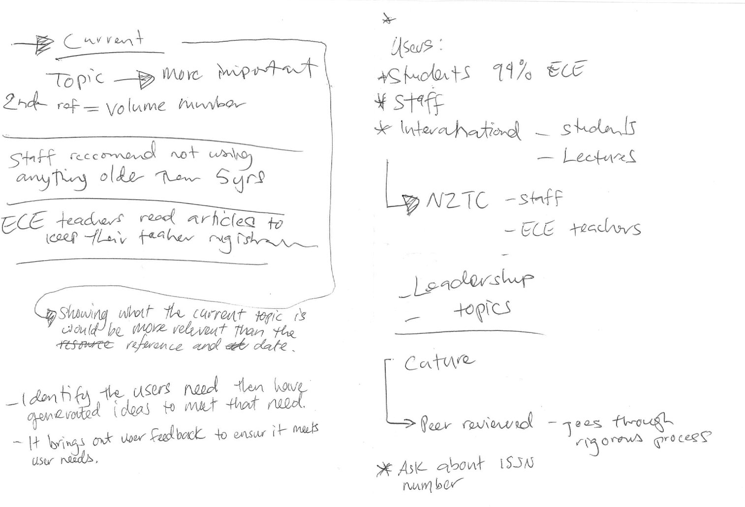
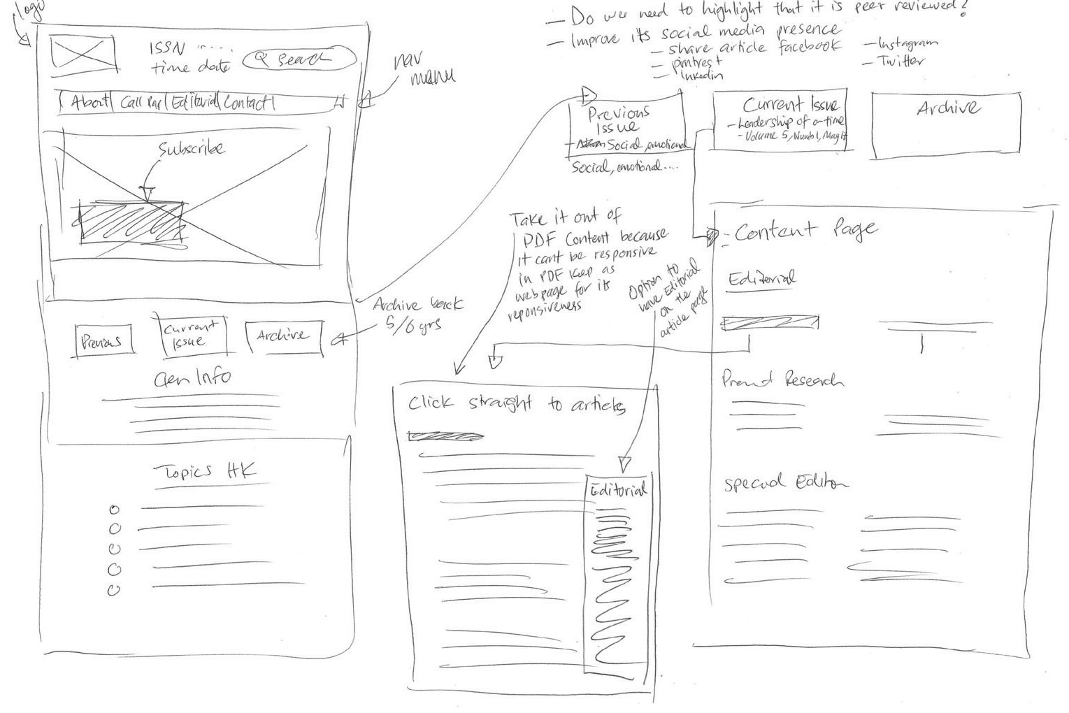
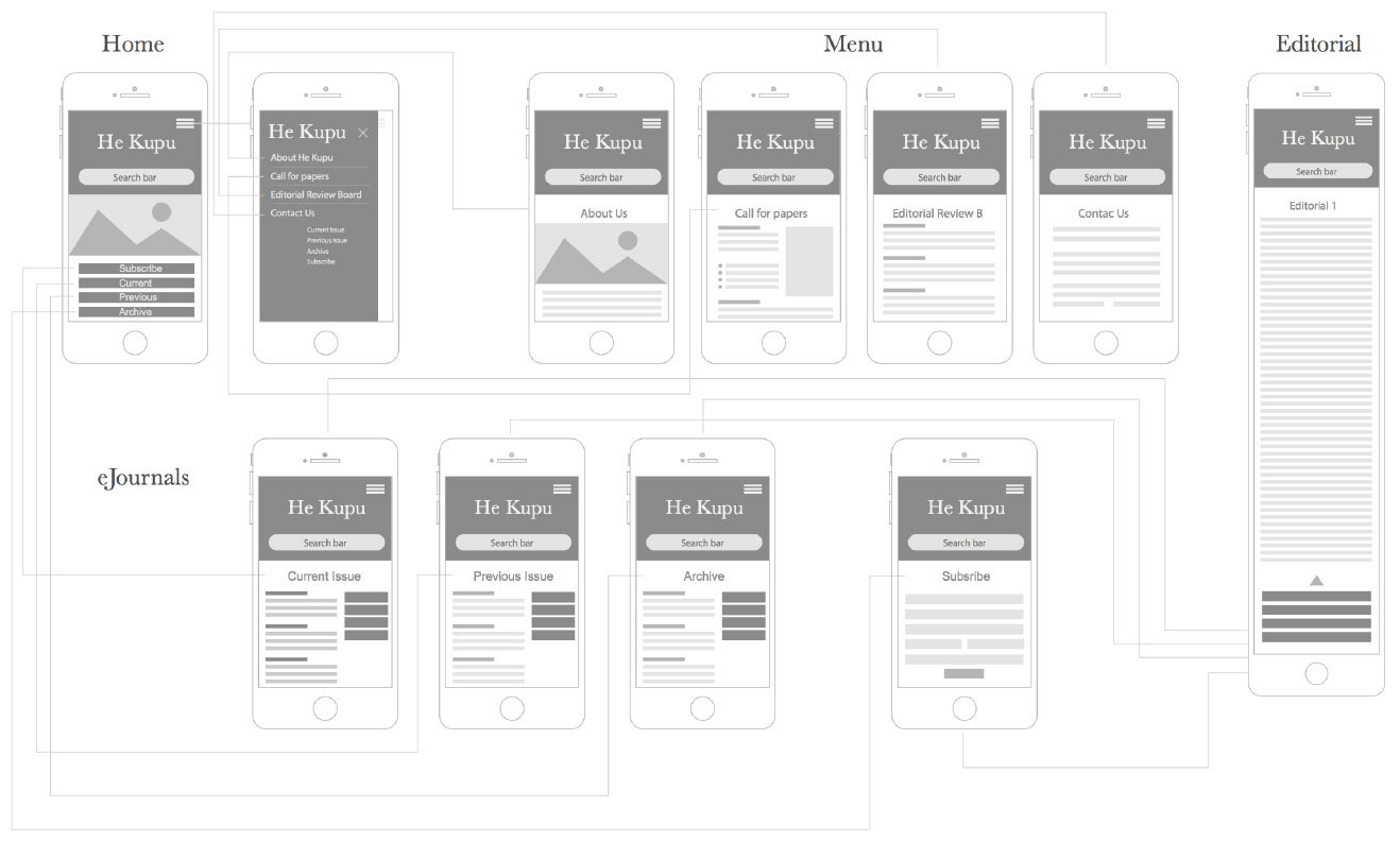
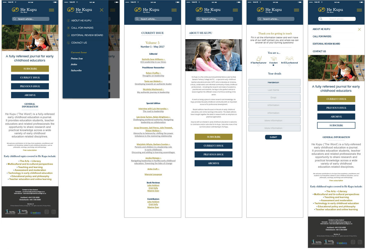
I redesigned the navigation system to prioritize contextual awareness. * The Goal: Ensure users always know where they are within the publication’s hierarchy.
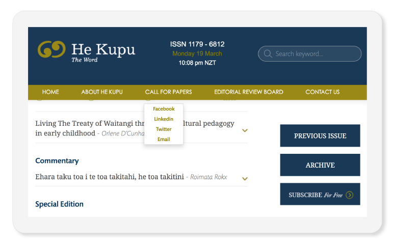
Research thrives on discussion. I integrated a social-layer UI to transform the journal from a static PDF repository into a dynamic community resource.
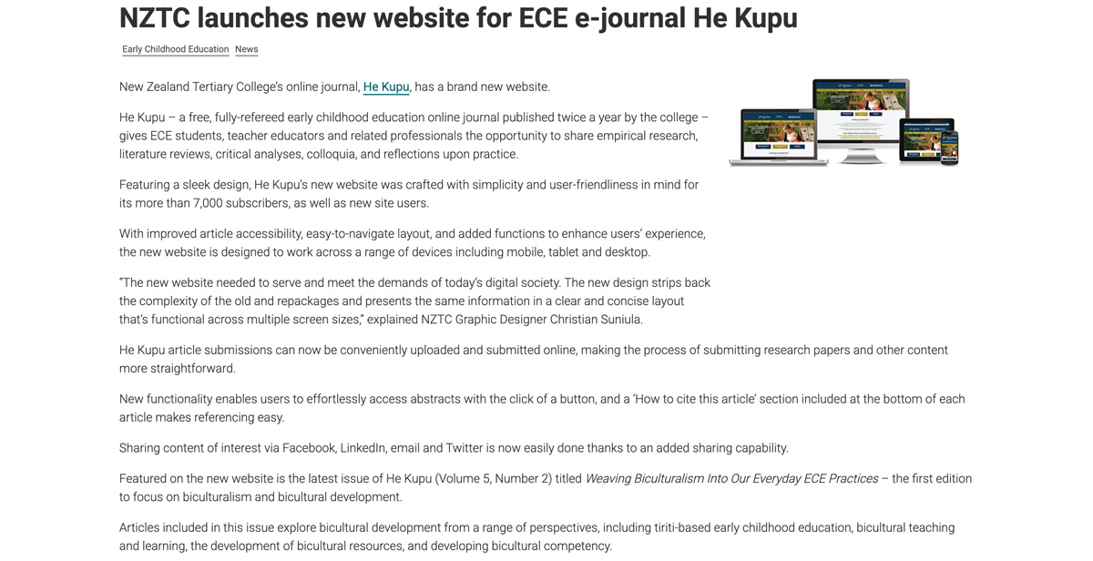
After a long and well-thought-out design process, the launch of the new He Kupu website has transformed the journal from a static archive into a high-performance digital hub. By moving away from the friction of the legacy system and prioritizing a "user-first" philosophy, the project didn't just improve the look of the journal—it fundamentally changed how the ECE community interacts with research.
The results of this strategic overhaul speak for themselves: following the launch, the journal saw a staggering 1,000% increase in subscriber numbers. This growth was fueled by the new responsive architecture and the seamless social integration, which allowed peer-reviewed content to be shared effortlessly across professional networks.
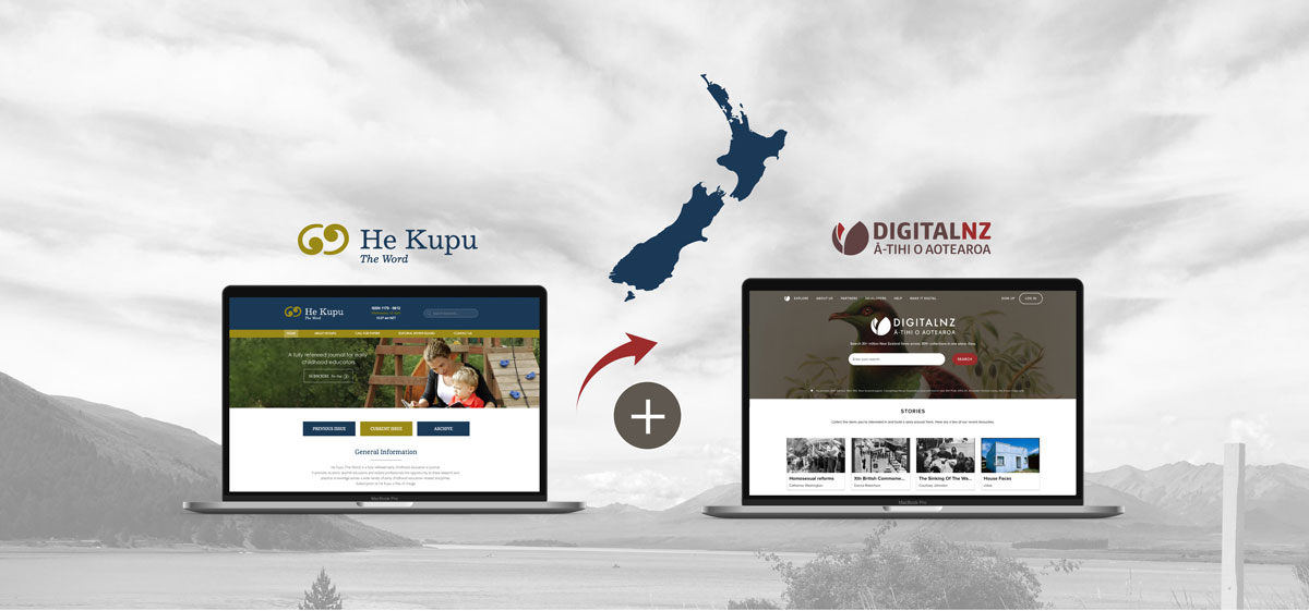
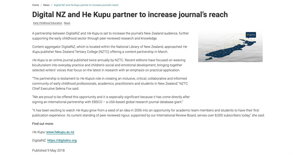
Furthermore, the project’s success was validated by high-level content partnerships with DigitalNZ (National Library of New Zealand) and the global research giant EBSCO. These partnerships, combined with the new online submission portal and automated citation tools, have solidified He Kupu’s standing as a premier resource. This project serves as a clear case study in how intentional UX/UI design can bridge the gap between academic rigour and practical accessibility, resulting in measurable, exponential audience engagement.